Black Bears Getting Fresh Threads for ’20-21

With the auctioning off of the jerseys for the first two years, it became clear the Maryland Black Bears would have new ones coming– but no one knew the kind of design they would have. That got answered on Monday when Black Bears owner Murry Gunty dropped huge news on Twitter Monday, showing off the new jerseys for the Black Bears for the next season and beyond.

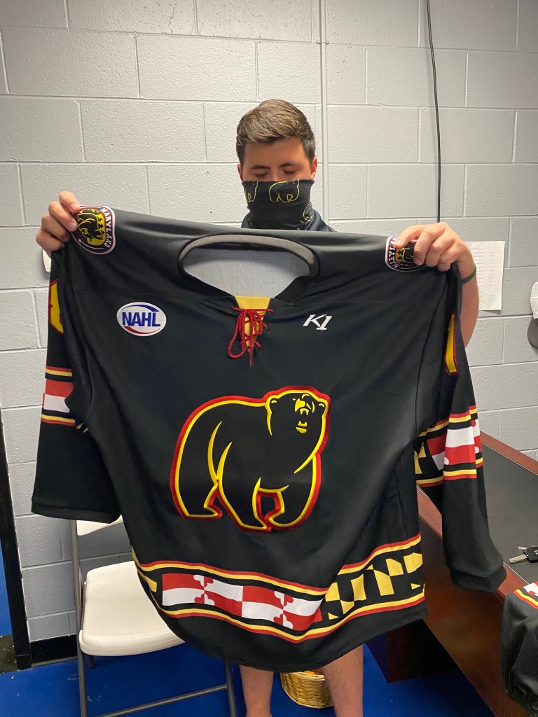
Both of the new jerseys are very Maryland-centric, with the flag being displayed prominently. As well, the Black Bears will use just the roaring bear for their jersey and not the crest from the first two season. The home yellows will have the Maryland flag completely across the chest and elbows, while the away blacks have a smaller, banner-like look to the flag across the hem and elbows. The shoulder patch is that of the original crest on the first jerseys.

They are quite the departure from the traditional jerseys that the Black Bears have worn to start the franchise, but this feels like the correct move forward. With the addition of the Maryland flag everywhere, it really puts it into the mind of others that this is Maryland’s hockey team. It will also stand out, with yellow being an unconventional home jersey color; but one that catches the eye across the league.

Personally, this is a great change, even if it seemingly came out of nowhere with the design change. I’m a big fan of the standing bear logo and though it would look great standing alone as the primary logo. While I did like the old ones for the traditional feel, the added Maryland touch is great progress for this team and the footprint they have with the community. There is one little critique I have and that’s the bottom hem of the black jersey and the Crossland flag being a bit cut off looking, which took me a little time to figure out what it was. Aside from that small thing– it’s tremendous and only hope the socks will have the Maryland flag on them in some way, shape, or form.

Remembering the Reebok Edge Rollout

The Rbk EDGE Uniform System (Photo by Mike Fuentes/Bloomberg via Getty Images)

As I was going through YouTube, a clip came up from 2010 when the Flyers beat the Bruins after coming back from 0-3 down in the series. I didn’t think about the hilarious collapse of the Bruins, but more of how horrible those Flyers jerseys were. They came from the redesign of the NHL’s jerseys by Reebok and their Edge jersey system. Then I remembered the start of the roll out of those jerseys at the 2007 Draft in Columbus. With Reebok being the ultimate brand in the NHL, they needed to do something with the uniform system; especially after Nike came out with their Swift uniform system for the 2006 Turin Olympics (which had their own issues before the Games).

Before the big rollout, the NHL debuted the jerseys at the 2007 All-Star Game in Dallas– which happened to be the last time the NHL had a weekday ASG. The jerseys did away with the bulk air-knit jerseys of the past and make them more anatomical for the players, which was perfect for the new speed that the game had brought back post-lockout. Reebok touted the jerseys were 14% lighter and had moisture resistant technology, which absorbed 76% less moisture. There’s much more, including the core technology they had put together in this video here.

As for the rollout itself, it went team-by-team; though the NHL Draft hosts in Columbus debuted their look at the Draft itself, as did the Capitals There were some teams that did an entire overhaul– like the Capitals, Sharks, and Canucks; while other teams kind of fell into a templated nightmare with other teams. For instance, the Penguins, Senators, and Lightning used the same template as the All-Star jerseys; while the Predators, Oilers, and Panthers used their own template with the latter two having unnecessary piping on it. The piping was also noticed around the shoulder yoke of the Carolina Hurricanes, which stood out like a sore thumb. Not only that, but half the league went without the traditional bottom hem stripe on the jersey. The wide array can be found on the NHL Uniforms’ site.

Interestingly enough, the jerseys were starting to get leaked on the internet thanks to EA Sports putting out an unlock code for the game before teams officially put the jerseys out to the public. It was truly a fun time for people who were pining to see what their teams would do, but also a cringe time for some when their team underwhelmed in this situation.

I like to remember is how the first versions of these jerseys were trash. They only lasted about half a year before Reebok had to redo the whole thing because the first version was doing it’s job by repelling moisture…but into the gloves the players making sweat pool in their gloves. That made Reebok revert back a little to the airknit fabric and making them a bit less form fitting. We did have a glimpse into the look of the jersey, as the Ducks and Sabres each had a redesign in 2006-07 that was a format for what the new jerseys would look like with the collar being very pointed and where the NHL logo would appear on all the jerseys a season later.

Looking back, it was a huge step for the jersey era; especially with MSRP of jerseys going up because of the materials used. It was also a sigh of relief as rumors had the system using tucked in jerseys killing any kind of loose fit. The Edge system also was the start of the Icethetics website, where a lot of the leaks were posted for wider consumption.

The look itself may have turned off some people because it wasn’t traditional enough for them, but in the end; we all made it out and now move on with life in the Adizero era where the weight feels more like the older jerseys, which doesn’t seem to affect the play on the ice with the players.

TEPID TAKE: Jerseys Aren’t THAT Bad

DCz1hVjV0AI6GtK

Look– the Nashville Predators jerseys are bad. Like…Sears Christmas Catalog looking bad. But, for me, it’s really the only one that stood out as truly awful in the new Adidas Adizero jersey reveal. The rest of the looks are pretty much the same, but the design of them brought about pretty big reactions. Of course, the Vegas Golden Knights finally getting an identity was a huge get, too.

There are some things I’m annoyed by already by Adidas, one of which is the designers calling them “tops” instead of jerseys. I know it’s just a lingo thing, but if we’re going to try to keep some tradition, let’s keep it at jerseys. Also, some teams stealing the NBA gimmick and putting the Stanley Cup years into the collar just doesn’t sit right– looking at you, New Jersey.

However, there were improvement to me. The Avalanche going back to their old design is a massive upgrade over the tripe they’ve had to deal with the past couple of years. Only when the third jerseys are back will they have a chance to ruin their identity again– but for now, they get a nice pass. The Hurricanes also reverting back to the old school and reintroducing the storm flags is a nice touch.

The biggest thing going in was the Vegas Golden Knights uniforms. Overall, they look like something the German National Team would wear. It’s a nice look, don’t get me wrong, but doesn’t scream Vegas to me. The white gloves with gold cuff and fingers does scream Vegas to me, which I’m glad they were brave enough to make that change and make white gloves not just for All-Star Games anymore.

Overall, the jerseys are kind of buy the book, with the exception of the Minnesota Wild hacking onto the Canadiens mid-stripe look. The biggest thing to overcome for me is going to be collar area, which everyone got a preview to in the World Cup of Hockey. I’m sure they’ll look better on the ice and grow on me as the Reebok Edge eventually did.

NHL: Three Stripes, New Jerseys

To the surprise of no one, Adidas is going to alter some jerseys next season for their first year as the official jersey supplier of the NHL. Adidas will take over for their sister company, Reebok, due to the restructuring they did with the NHL not too long ago.

But the report that over a dozen teams will be getting a change is really the sticking point, though Chris Creamer said that it could be as minor as the teams booting alternate jerseys to full-time status since the alternate jerseys are going the way of the dodo, again, for next season– though it’ll be interesting to see how that plays out for the outdoor games that will be going on.

The one shocking thing is that the Sabres are once again going to change their uniforms. According to NHLUniforms.com, since 2005-06, the Sabres have had nine jerseys, including the Buffaslug and Turdburger jerseys, but not counting the change from the old jerseys to the current Reebok edge. The Sabres have surpassed the Canucks in jersey changes in the shortest timespan.

But the only good thing is that if Adidas really wants to put their brand on something– the Sabres jerseys would be the best. Sure, everyone is going to be having some kind of “three-stripe” on their jersey– minimalist or otherwise– but the Sabres are prime candidates to be the poster child for Adidas. Look at the original jerseys for the Sabres– their socks alone had three stripes of three stripes. It’s stripe-ception for crying out loud.

Sabres01.png

Granted, the wouldn’t be able to put Jack Eichel away from Bauer, but the point is that the Sabres could be the NHL’s Oregon Ducks to Nike or Maryland Terrapins to Under Armour with the stripes they could have.

In any case, it’s much ado about nothing. A lot of the changes, I’m sure, will be minimal and the teams that need an overhaul will get it or they will just stick to some generic garbage that they have now.

My only request is that no more unnecessary piping. Enough. We get it, you can template a uniform. Be done with it.