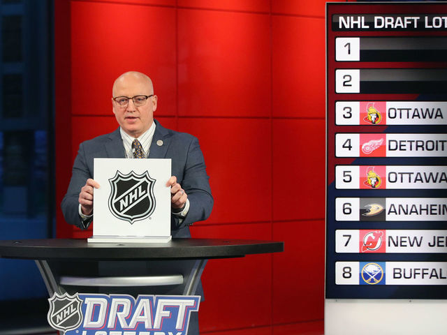
After having time to think about it– the mystery Team E winning the NHL Draft Lottery is the BEST POSSIBLE OUTCOME for the Qualifying Round of the playoff restart.
Yes, it sucks for teams like the Detroit Red Wings and Ottawa Senators to not get a top pick after being terrible this past season. That said, some might say that getting Alexis Lafreniere isn’t going to be the cure-all for those teams. It would be nice, sure, but at the same time– it may not address the needs those teams need in the long-run.
But with Team E winning the Draft Lottery, it will get more people into the Qualifying Round and to pay attention to those who get eliminated. If the NHL and NBC marketing teams were smart, they’d have a little side promotion about how even if you lose out– you might still win with the 1st overall pick in the Draft. It might hook on some people who may not watch the qualifying rounds because it’s teams just getting back going after four months of a layoff, but it adds another thing of weirdness to an already weird timeline we’re living in.
Granted, there’s going to be plenty of conspiracy theorist that the NHL rigged this for certain teams to get a chance should they be eliminated in that qualifier, especially if teams who are already loaded– like Pittsburgh and Edmonton– get the first pick through fate. Even so, though– it would be a nice little touch for teams that are hated because they have so much talent to get more and for fans around the league to have a black-hat villain to look towards.
While this wasn’t the most unconventional Draft Lottery– that is held by the 2005 Lottery– this is probably the most fun. I’m all for chaos and schadenfreude in the the NHL, it makes watching it fun for me. This was the best outcome for the league because of the fact they need all the attention they can get, especially with the pause of the season. To get eyes on the game because the qualifiers will help determine who gets the top prospect of the draft is an amazing gimmick.
It’s easy to understand why people are butt-hurt. It may have looked like a bad idea for the league to have a Draft Lottery with teams who haven’t lost yet getting the top pick, but in the grand schemes– this is the best possible outcome and may translate into more people paying attention to the qualifying rounds when they may not have.
Though, let’s be honest, it might not be a concern at all if the NHLPA doesn’t agree to the season ending or the qualifying round getting stopped due to sickness– but it’s still a nice thought to have that it becomes Mario Kart rules where even if you lose in the playoffs– you could possibly win the top overall pick in the Draft.